How to display a graph in Excel with two axes and different units (Excel 2019)
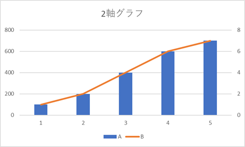
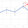
When you are creating a document, do you ever want to create a graph with two axes like the one in the figure above?
It is like a graph with axes on the left and right, where the bar graph shows the absolute value and the line graph shows the percentage.
In this article, I will show you how to create such a graph in Excel.
If you often use graphs in your documents, try to learn it because it is easy.
How to make a graph with two axes “Change Graph Type".
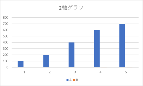
Change a bar chart like this to two axes
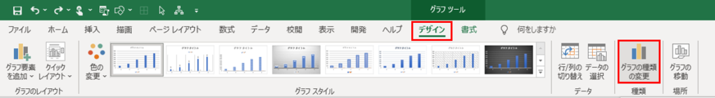
When you select a graph, the Graph tool will appear in the ribbon.
Select the Design tab and click on “Change Graph Type" in the tab.
(You can also do this by right-clicking on the graph.
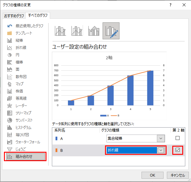
Select “Combinations" on the left.
Change one of the series to a broken line, etc., and check the checkbox for the second axis.

Now we have a graph with two axes.
This can be done easily by using the “Change Graph Type" function, so please keep creating stylish graphs.
Related Articles